SS25
info
Blackbird Coffee
web,
visual identity,
printed matter
Blackbird Coffee is built on two things that rarely go together: uncompromising technical precision and a deep sense of responsibility – for flavor, for the environment, for the people behind every bean. Their commitment runs from high-spec machinery to their own agroforestry cultivation.
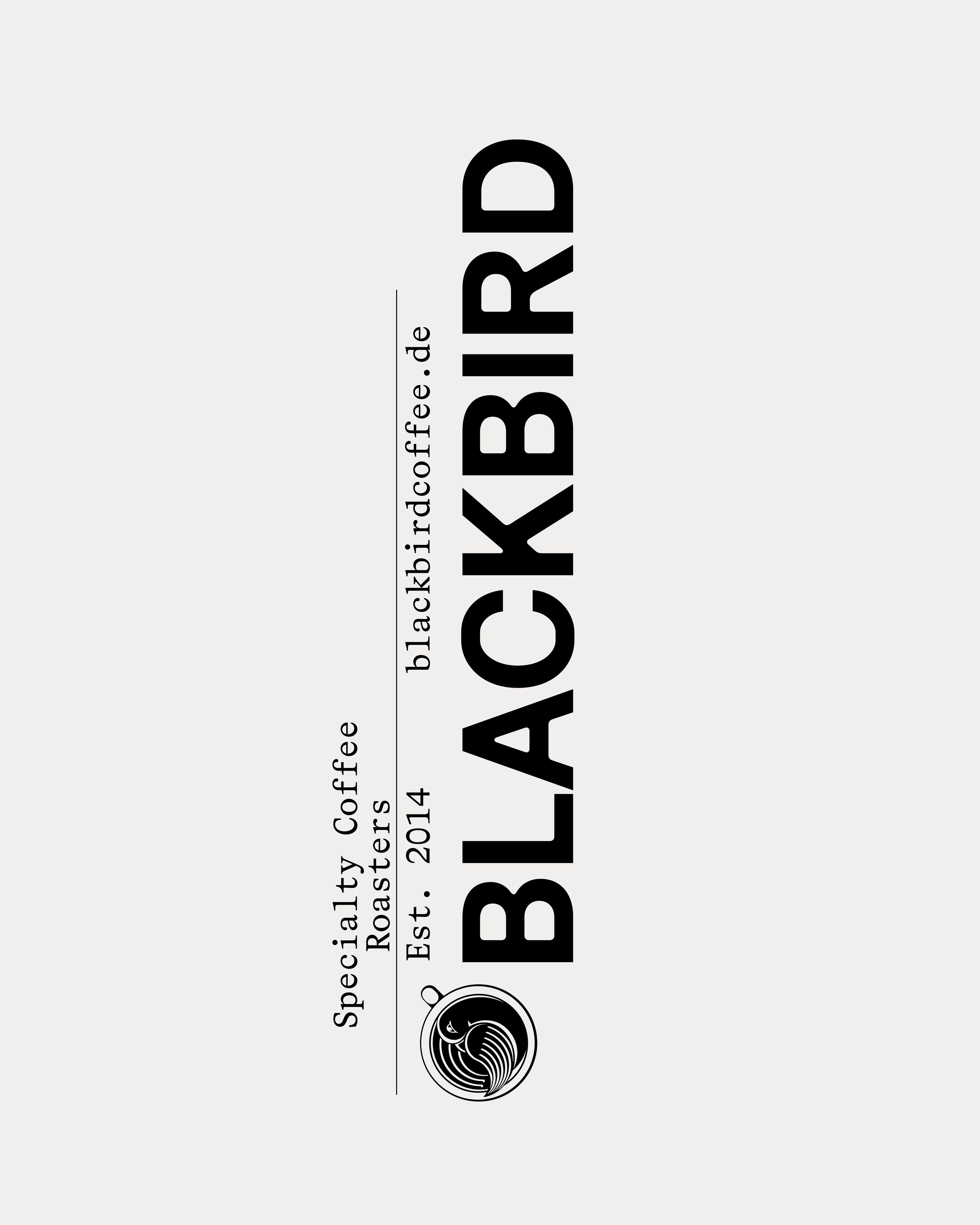
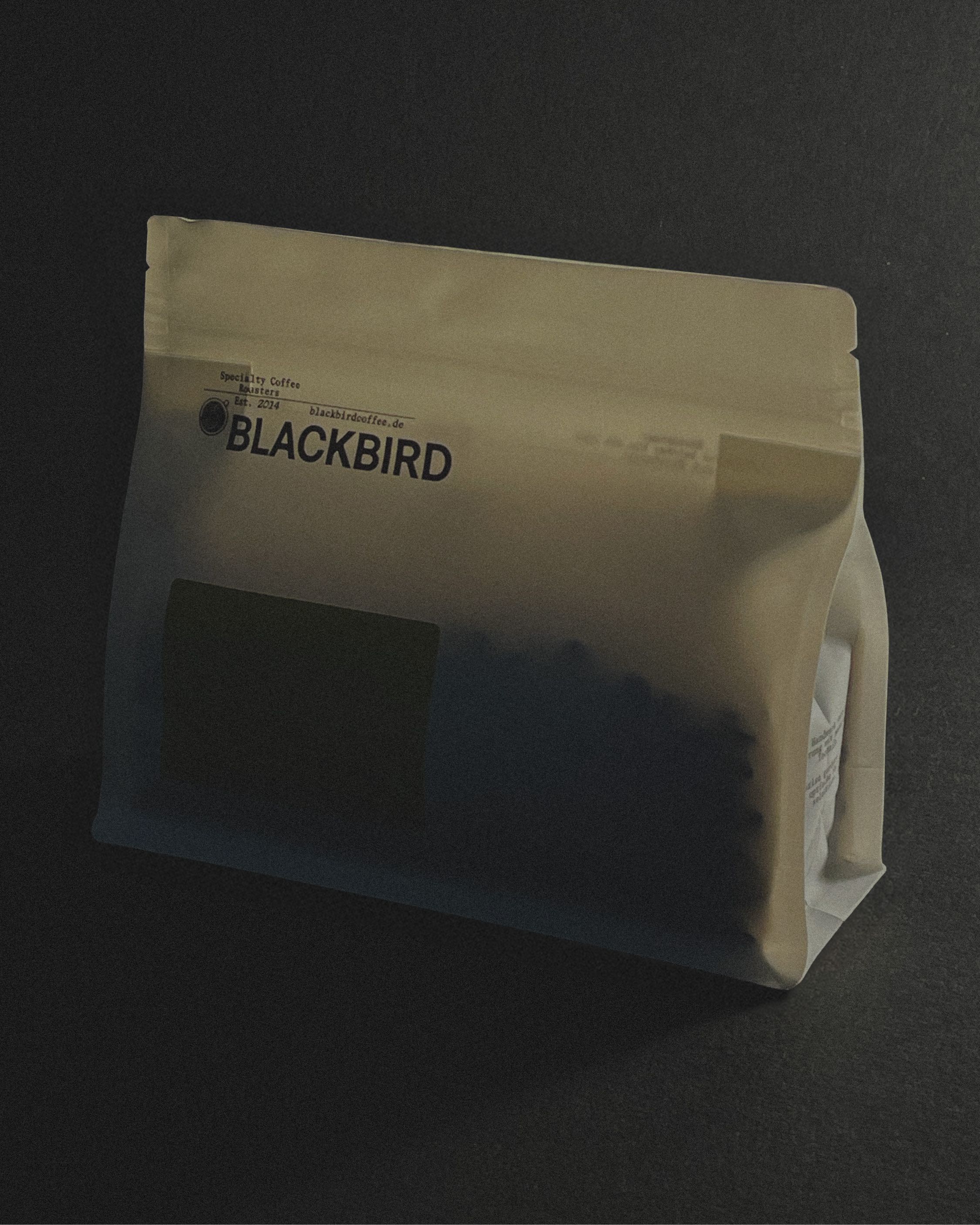
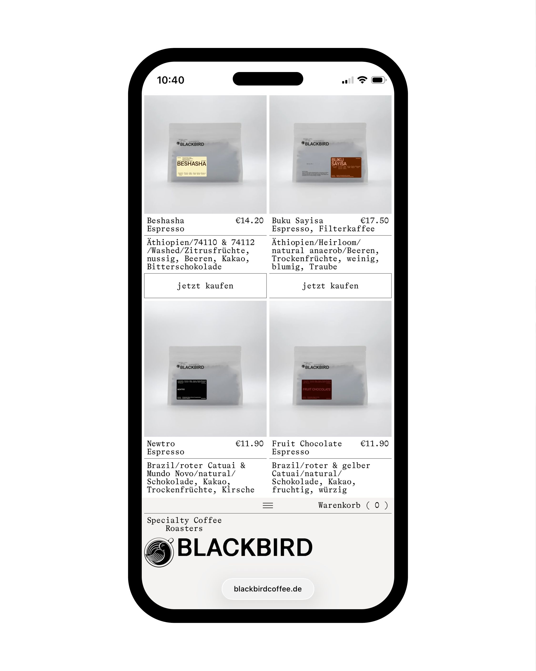
The typographic system we developed reflects this tension. A monospace carries the technical rigour of the roasting process; a grotesque with subtly tapered corners holds something quieter – a formal echo of espresso drawing from a portafilter. Two typefaces that don't resolve the duality so much as hold it. Custom graphs map the key parameters of each coffee – origin, roast, flavor. Not as decoration, but as a genuine extension of Blackbird's belief that knowledge and transparency are part of the product. Embedded into the website, they remain legible to search engines – and to anyone who wants to understand what's in their cup. The packaging follows a similar logic: one print run, two product lines – Exceptionals and Standard – distinguished by a shift in label placement alone. A material decision that reduces waste and cost without reducing coherence. Have some lovely coffee at blackbirdcoffee.de